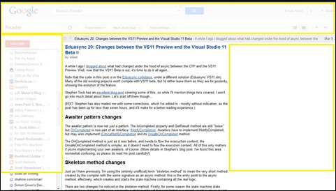
Since Google changes the look of its products very often, most likely this post will be out of date soon, nonetheless I believe it’d be a good to share my thoughts about Google Reader’s current UI… with a little rant.
- Lots of real-state waste:
All the areas surrounded with yellow borders are a wasted, especially that I have no control over hiding or showing them (click on image to see it real size): - Actions RARELY used are ALWAYS available, and taking too much space:

- Actions most used are small, at the bottom of the post, and not always in view:

- The highlight of the selected blog isn’t clear enough:

- Title doesn’t stay in view while scrolling (negotiable):

Ok Google you did a great job introducing GMail and Reader with all this labeling and cool stuff, how about little bit attention to UI?
